Creating Icons
Design Principles
Outkit system icons follow a set of core design principles.
- Clean and consistent. It's important that we practise what we preach when it comes to consistent, on-brand design. Follow the design guidelines to ensure a seamless experience.
- Simple and concise. We prefer simple over complex and literal over abstract for our system icons, ensuring readability and clarity at small sizes.
- Global and accessible. When possible, using a universally recognised icon. When deciding what symbol should be used, check that is will be understood at a glance by people from diverse backgrounds, languages and cultures. For example, the dollar sign ($) would only symbolise money in certain locations.
To use an icon, refer to the component documentation.
Set-up
Download the 20px grid template to get started. It is recommended that you create icons with pixel grid snapping on.
Layout
Icons use a 20x20 pixel base grid with 18px live area and 1px reserved for padding and optical sizing.
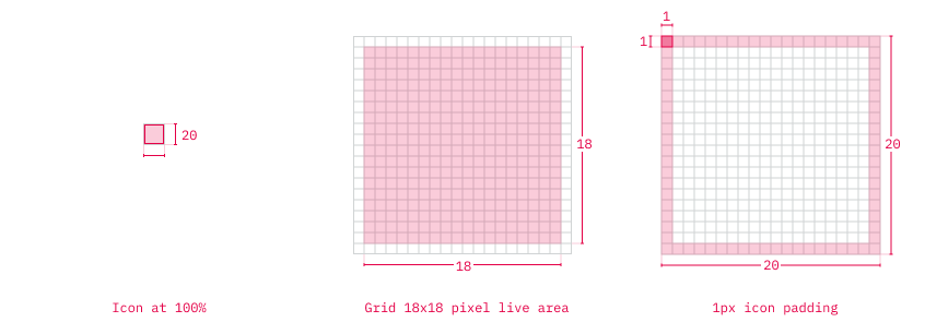
Icon content should remain inside of the live area. If additional visual weight is needed, content may extend into the padding between the live area and the icon bounding box. No parts of the icon should extend outside of the bounding box.
To ensure undistorted export, ensure that all icon elements are perfectly aligned to the pixel grid.
Keylines
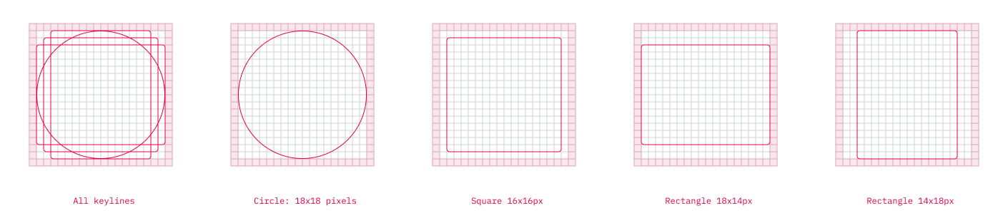
The keyline grid enables us to unify our icons and maintain optical balance.
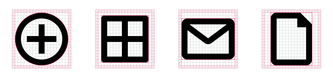
The keylines suggest basic sizing guidelines for squares, circles and rectangles. Use these guides to ensure all icons are proportionately consistent but remember - they are a guide, not a hard rule.
Examples:
Design
Anatomy Guide
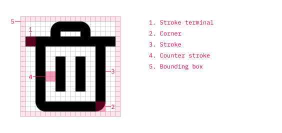
Stroke
All icons use a consistent stroke width of 2px with square terminals.
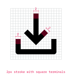
A 1px gap between elements is acceptable, but 2px is preferred when possible, to aid legibility.
Corners
Corner radius is 1px by default. A value of 0 or of multiples of 2px can also be used if required to better represent the metaphor.
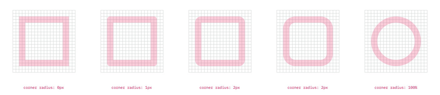
Interior corners should be square, not rounded.
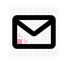
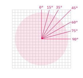
Angles
Use increments of 15 degrees to ensure consistency.
Exporting
- Once you have designed your icon, outline all strokes (Object > Path > Outline Stroke).
- Merge any shapes using the pathfinder Unite tool (Window > Pathfinder)
- Export your icon as an SVG
- Add the icon as a component in the Icon section of Outkit Figma, ensuring it contains of only 1 layer. Icons should be named using kebab case (all lowercase, with words repeated by a hyphen).